What does our eye scanner do?
The importance of user experience
Therefore, design needs to consider the user's experience and create situations where the user hardly has to think or wonder about things. The user simply does what is instinctive to him and everything falls into his hands. If you need to think about what a certain button does on a website or don't know what to do, then the design has failed.
And failures are costly.

Where do the eyes wander?
The best way to avoid mistakes is to never assume anything but to test, test and test. User testing is of various kinds, enables us to identify the pros and cons of UI design and to improve the performance and user experience of existing products.
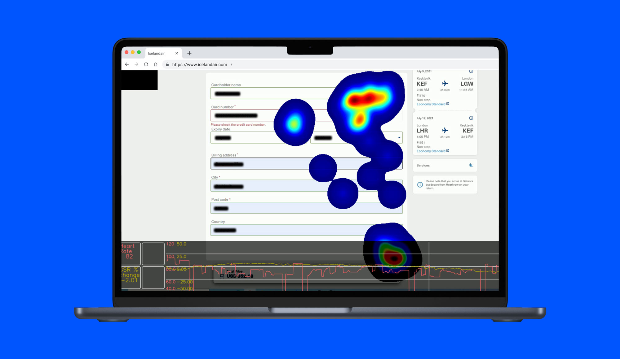
At Jökulá we use an eye scanner that measures where the user's eyes are looking on the screen. We can find out what attracts the most attention, what causes stress, where the user looks, what he doesn't notice, and what individual actions, content or information change his emotions. The eye scan also comes with a high-precision body scanner that measures heart rate and electrical resistance to the skin, indicating what affects the user experience.
People's attention is measured in seconds. The user notices what interests him—not what you think matters. If the user has not found what he is looking for in two seconds, he is gone. And what's more, the information may be there, but it's not where he expected it. The user only notices what interests him —not what you think is important.
How does the eye scanner work?
We choose users to test a website or digital product. After adjusting the eye scanner, we give the user a task to solve on the web. His eyes flutter around the screen in search of an answer or tool that allows him to solve the task.
We study where his eyes look and how stressed he gets. Flickering eyes indicate that he doesn't know where to look, high sweat levels are a sign of stress, a long response time tells us he's looking for information.
All actions should be quick, simple and obvious. When it's not, it's clearly apparent.

Don't trust the design. Test it.
It's almost never too early to try a design. The fundamentals of information flow and architecture can be tested before design, in which case problems and opportunities can be identified before time and resources are provided in design.
Similarly, you can always test the current design of a website, advertisement, brand and even packaging. As long as the product can be placed on a computer screen, we can test it.


