Words used by only web designers
Wireframe
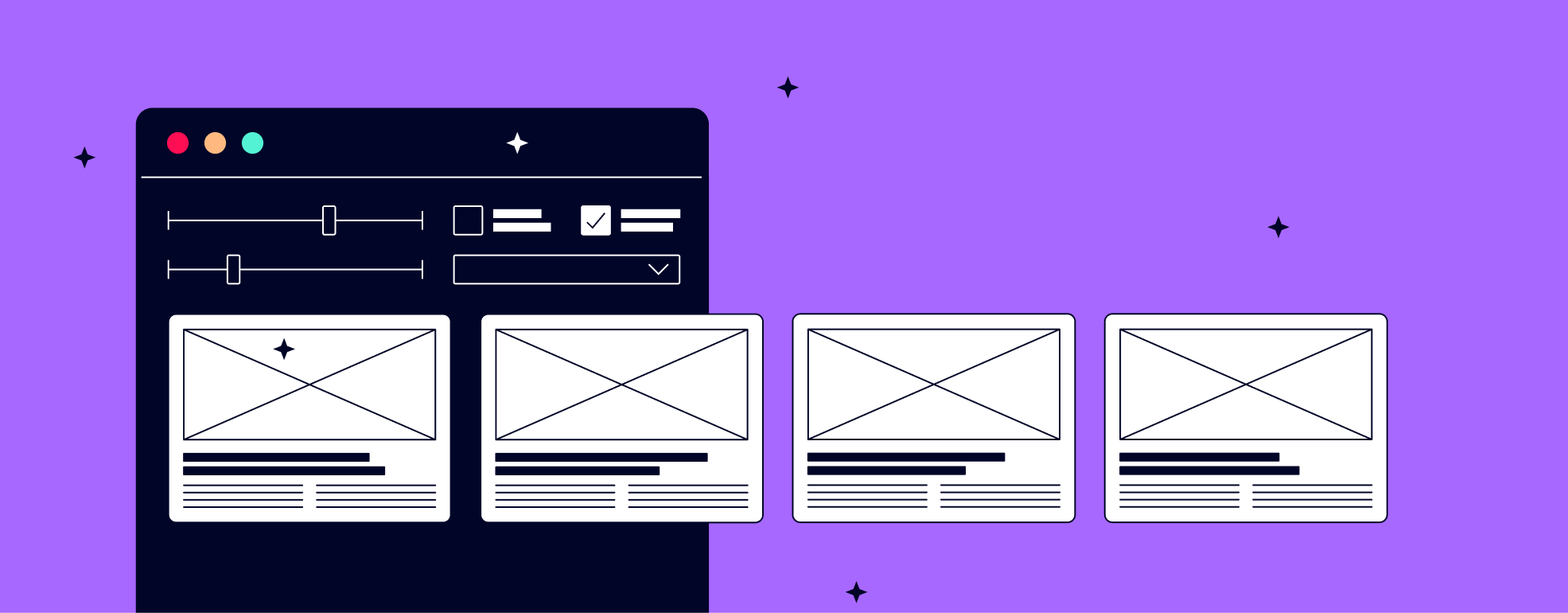
A wireframe is a work document that can be described as a skeleton of a website. It shows where images, text, and buttons will appear, often with lines, colors, and explanatory text. The idea is to show the structure of the page and its elements before getting into the design of the images and text content.
User persona
User personas are created based on research of the website's target audience and are "representatives" of specific target groups. The aim is to define the users of the website with a certain level of accuracy and to focus user flow and experience based on them. With user personas, we better understand the user's needs and ensure that we create an experience that suits their needs.
User flow
User flow is one of the first steps in web design where the designer draws up the story of the user from the moment they enter the website until they achieve their goal. In the user flow, we both draw information that the user sees and the decisions the user makes based on them.
Kerning
Kerning describes the spacing between characters in designed content. The spacing between the characters is crucial for the readability of the text and harmony.
White space
White space is not unused space. It is a part of design that is equally important as graphics, and the role of white space is to give graphics breathing room and direct the eye to what is important.
Copy
Copy is commonly used for text used in design, whether in web design or advertising. There are many subtypes of texts, each of which has its own role to play.
Microcopy
Microcopy is short text in the interface that guides the user and tells them what to do. Examples of such text are "continue" or "proceed with order" in an e-commerce website, small notifications or descriptions of product categories.
Breadcrumb – Breadcrumb Trail
In web design, a breadcrumb trail is a useful way to show the user where they are and how they got there. In its simplest form, this is a visual description of the location of the current subpage in relation to the home page.
Visual hierarchy
Visual hierarchy describes how the eye and sub-conscious mind interpret and assess the importance of visual information. Why are the eyes drawn to certain things? What does the mind consider important and what not? It is the designer's job to make sure this hierarchy is both clear and correct.
The main tools for creating visual hierarchy are size, colors, contrast, alignment, repetition, proximity, blank area, texture and style.
Hover
Hovering describes when a mouse cursor goes over something. In web design, it often refers to a place where hovering over a button or something that can be clicked reveals to the user what actions are available.
Responsive design
Responsive web design adapts to the size of the screen that the website is displayed on. The responsiveness ensures that the website is equally clear on both computer and mobile screens.
UX - User Experience
All actions, whether it is opening a door or turning on a computer, are user experiences, i.e. your experience as a user of the object. In web design, the focus is on making the user experience smooth and simple and maximizing the user's experience in order to encourage engagement.
UI –User interface
An interface is what many users interpret as the actual website, i.e. a combination of text, keys, graphical content and messages. Interface is designed to enable the user to achieve their goal on the website.
